
_edited.png)
Must-See Color Inspirations for Your 2025 Home Makeover
- Suria Decor Sdn. Bhd.
- Jun 8, 2025
- 2 min read

With half of 2025 already behind us, now is the perfect time to start planning your home renovation or interior refresh. In this week’s blog, we’re diving into one of the most beloved collections among interior designers: the JOTUN MAJESTIC PURE COLOUR series.
This collection is all about pure, natural, and versatile color tones, ideal for a wide range of interior styles—from Scandinavian to minimalist to modern natural.
The MAJESTIC PURE COLOUR palette is organized into six major nuances: BEIGE, PEACH, YELLOW, GRAY, GREEN, and BLUE, each with a unique atmosphere and mood. We’ve handpicked three of the most popular and universally flattering shades—let’s take a closer look!
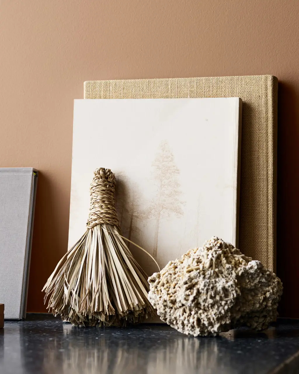
1931 CASCHEW
(from the BEIGE NUANCES collection)|

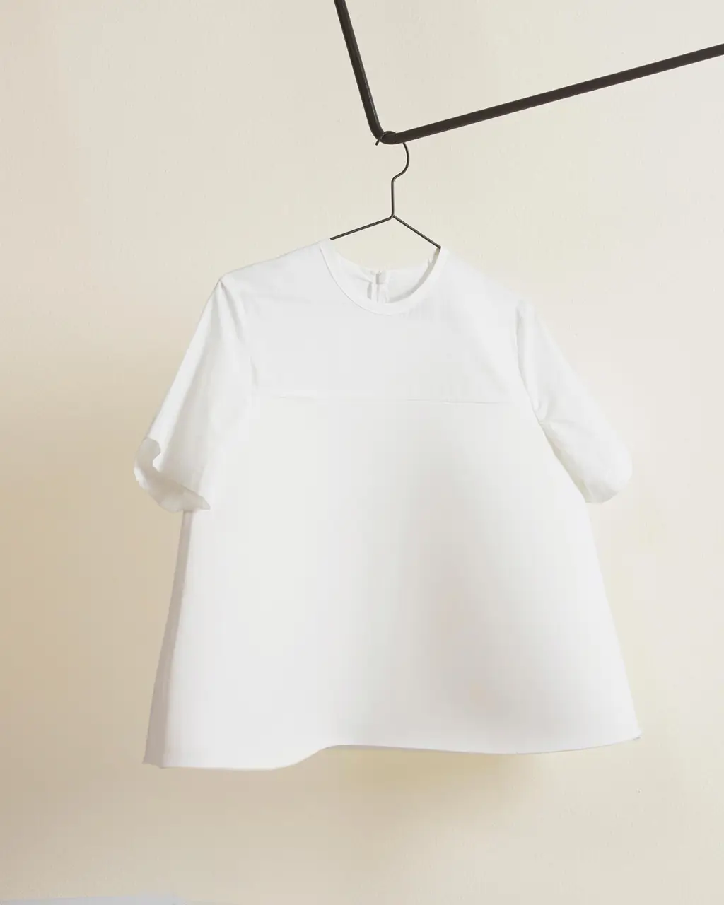


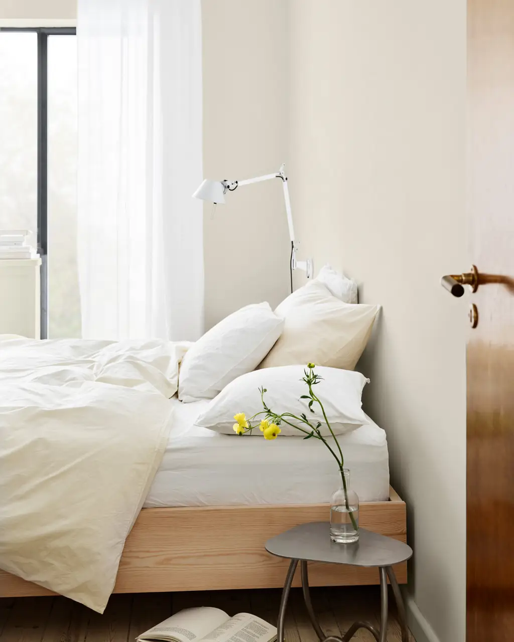
Design Highlights:1931 CASCHEW is a soft, warm beige with an apricot undertone. It’s richer and more layered than traditional beige, striking a balance between warmth and sophistication without being dull or overwhelming.
Best for:This shade brightens up any space without making it look flat, making it an ideal go-to base color. Whether paired with light wood furniture, cream textiles, or minimalist design elements, it creates a gentle, clean, and high-end aesthetic.
💡Hera Extra tip:
Perfect for living rooms, bedrooms, or open kitchen-dining areas. Combine it with metal accents, woven rugs, or raw wood textures to achieve a modern natural feel. This tone works beautifully with Nordic or Japandi styles alike.
8124 MALMO
(from the YELLOW NUANCES collection)|

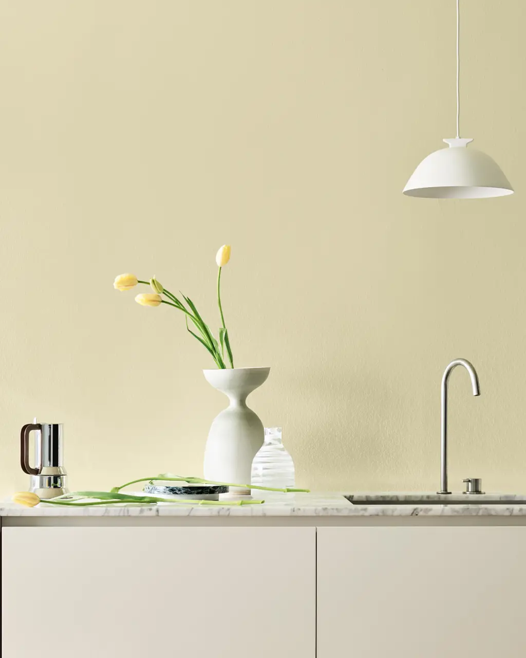


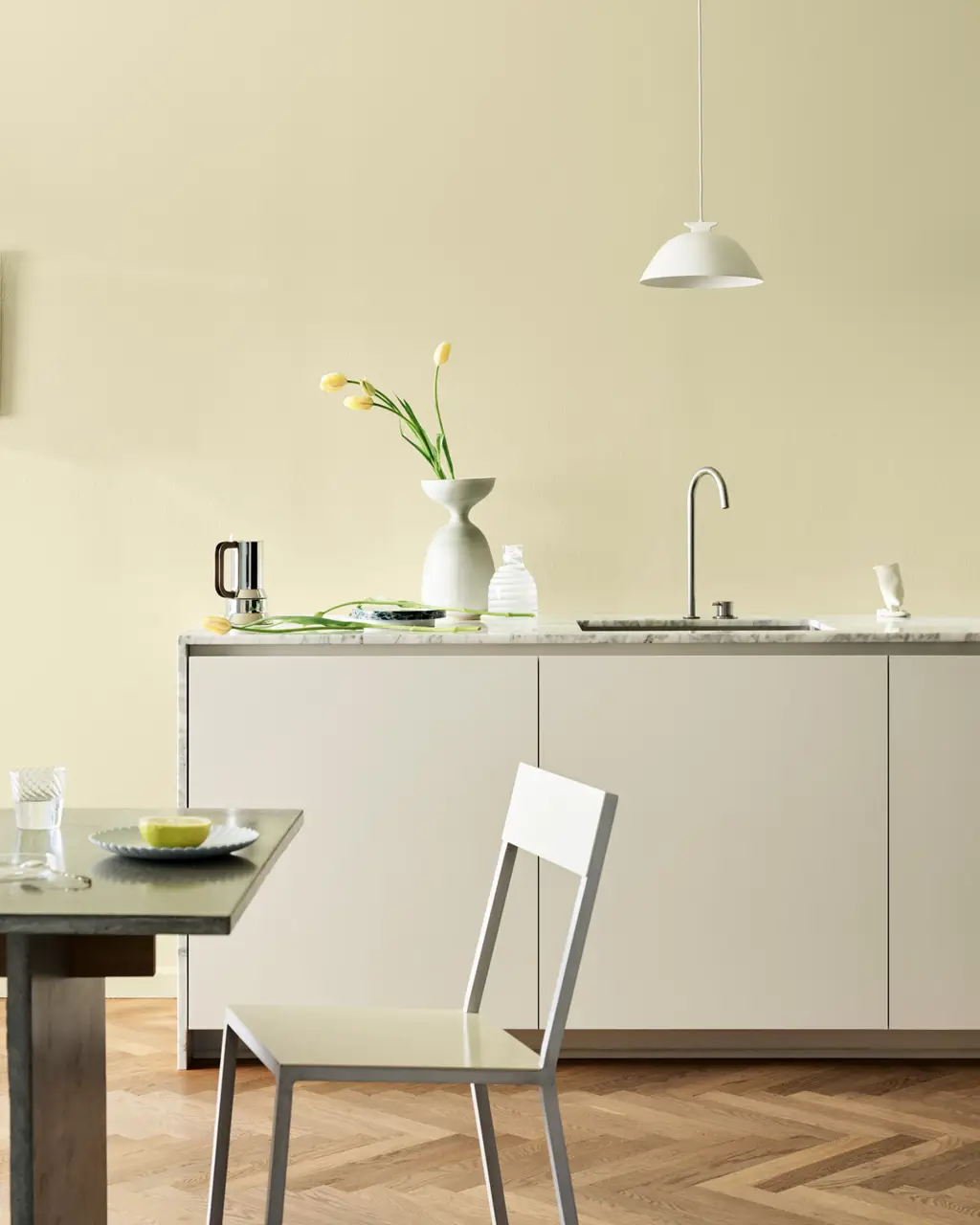
Design Highlights:8124 MALMO is a lively and soft yellow—not as sharp as lemon yellow, but with a creamy undertone that adds a playful, fresh feel to any space.
Best for:Especially great for compact or low-light areas such as children's rooms, reading nooks, hallways, or small kitchens. It adds energy and vitality, making even the smallest space feel open and spirited.
💡Hera Extra Tip:Pair this shade with white or light wood furniture to create a bright, cheerful vibe. It’s also known in color psychology for its mood-lifting effect—ideal for areas where you want to start the day with positivity!
11175 ADVENTURE
(from the PEACH NUANCES collection)


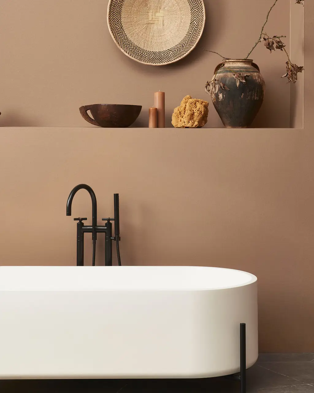
Design Highlights:11175 ADVENTURE is a deep peach tone that sits between rosy brown and warm sandstone. It’s rich but not overbearing, bringing a sense of grounded strength to a space.
Best for:This color delivers a moody yet comforting ambiance, with a warmth reminiscent of desert landscapes. It works well in cozy, introspective spaces like home offices, bedrooms, or as a bold accent wall in entryways.
💡Hera Extra Tip:Pair it with earthy tones like terracotta, olive green, or soft greige to create a calm, grounded aesthetic. This shade adds a sense of security and natural elegance, evoking a tranquil, cocoon-like feel that soothes the senses.

✨ Final Thoughts
What makes the JOTUN MAJESTIC PURE COLOUR collection so unique is its refined simplicity—these are premium, timeless colors that don’t need complex pairing. Whether you love natural minimalism, cheerful palettes, or rich cozy tones, this collection brings a refreshing sense of calm and style to any home.


Comments